Summary Charts
The dashboard charts provide a snapshot of how your PathFactory marketing has performed in the latest period.
These charts help you quickly answer the following questions:
- How engaged are your visitors?
- How many visitors have you had across all Content Tracks?
- How many accounts have engaged with your Content Tracks?
- How many of your content assets have been viewed across all of your Content Tracks?
|
Note
|
Customize this view by selecting a specific time-frame for your data (the past 7, 30, 60, 90, or 365 days), and choosing between daily or cumulative views. |
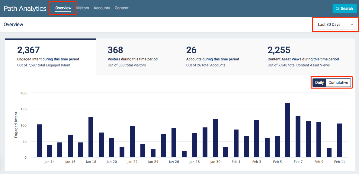
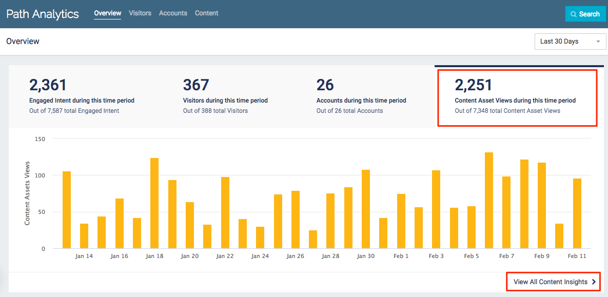
Path Analytics Overview page
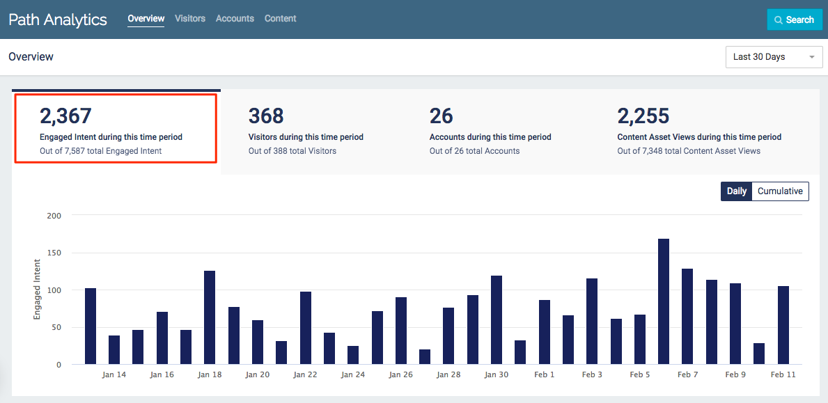
Engaged Intent
This table shows how much engagement your Content Tracks have collectively generated in the defined period.
Engaged Intent example
Each chart summary compares the data from the selected time-frame to the total data from the past 365 days.
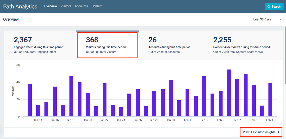
Visitors
This table shows how many visitors you had across all content tracks in the defined period.
Visitors example
- Each chart summary compares the data from the selected time-frame to the total data from the past 365 days.
- Click View All Visitor Insights to go to the Visitors page.
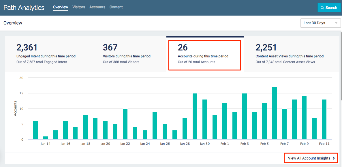
Accounts
This table shows how many accounts engaged with any of your content tracks during the defined period.
Accounts example
- Each chart summary compares the data from the selected time-frame to the total data from the past 365 days.
- Click View All Account Insights to go to the Accounts page.
Content Asset Views
This table shows the total number of content assets which were viewed during the defined period.
Content Asset Views example
- Each chart summary compares the data from the selected time-frame to the total data from the past 365 days.
- Click View All Content Insights to go to the Content page.
Additional Insights
Each of the following topics is displayed on two charts: one for the selected time-frame, and one for the past 365 days.
Visitor’s Engaged Intent
This stacked bar chart displays the total number of known and unknown visitors your Content Tracks received, sorted by engaged intent.
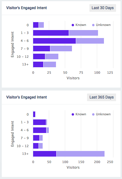
Examples of Visitor’s Engaged Intent
Account Distribution
This chart displays the total number of accounts which engaged with your Content Tracks, sorted by engaged intent.
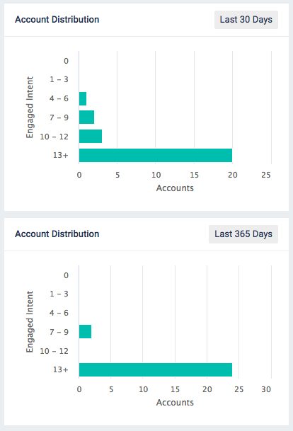
Examples of Account Distribution
Topic Engagement
This chart displays your top 5 topics according to the engagement time they are associated with.
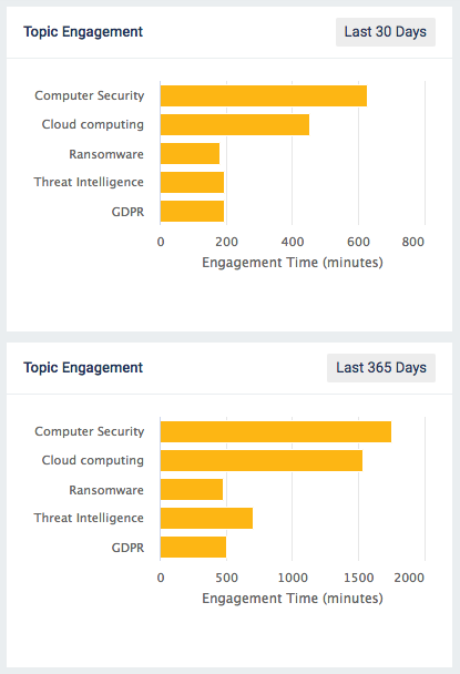
Examples of Topic Engagement